


Talentfindr
Client: Talentfindr, Year: 2025
Over several months, I partnered with the Talentfindr team to redesign their recruitment platform, turning a complex search tool into a simple, intuitive, and fully self-service product ready to scale.
(01) Overview
Redesigning a powerful recruitment tool into a simple and scalable product
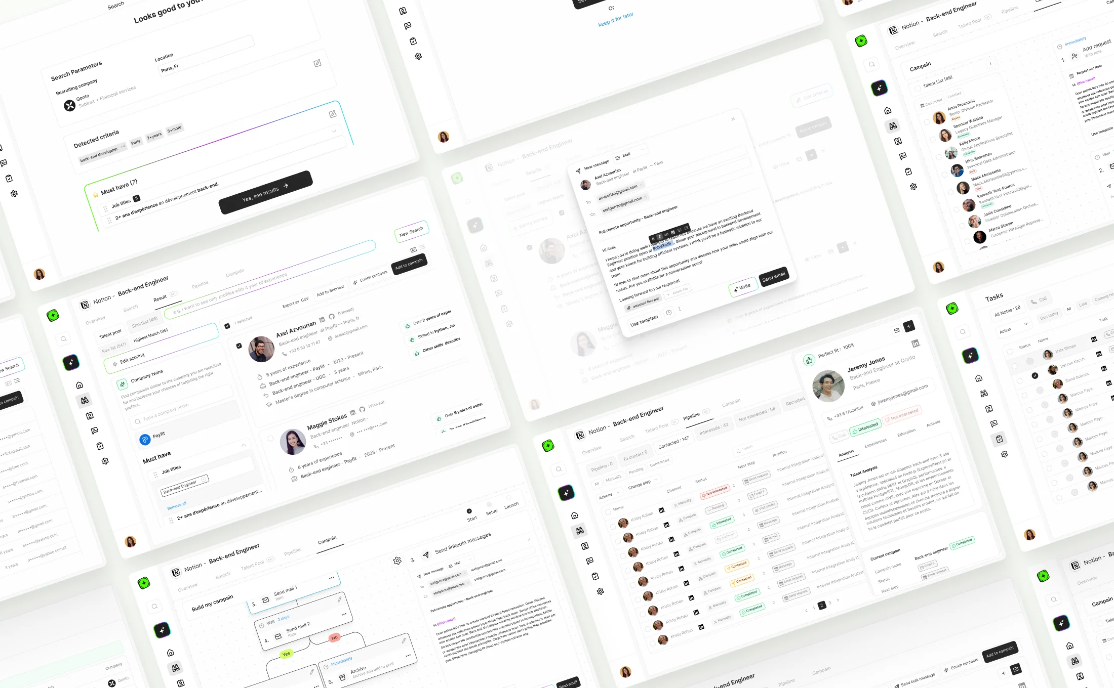
TalentFindr approached me with a clear ambition: transform a powerful but complex recruitment tool into a product that recruiters could use independently, without relying on support. The challenge was to simplify the entire experience while keeping the depth and precision that make sourcing effective. Through user research, competitive analysis, and iterative design, I reimagined the core flow from search to outreach, introducing a cleaner interface, smarter interactions, and accessible AI features. The result is a product that feels lighter, faster, and easier to adopt, helping TalentFindr scale its solution and reach new markets with confidence.

(02) Discovery
Understanding real user behaviors to create a more intuitive product
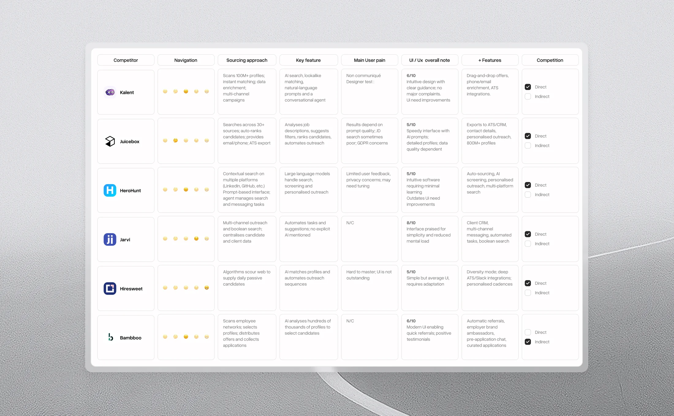
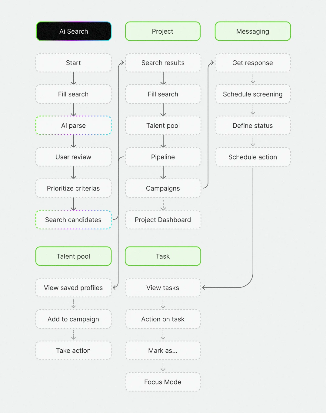
The discovery phase aimed to deeply understand how recruiters actually used the tool and where they struggled. Through competitive research, customer feedback analysis, and persona building, I mapped the key steps of their journey, from launching a search to contacting candidates. Patterns quickly emerged: users weren't asking for more power, but for clarity and ease. This insight shaped the foundation of the redesign: a product that feels smarter, lighter, and naturally intuitive to use. When studying the competition, I observed that most tools overloaded users with complex features, often resulting in cluttered and confusing interfaces. The opportunity for TalentFindr was to stand out by radically simplifying the experience while introducing innovative use cases. Instead of replicating already-seen approaches, the focus was on a cleaner interface and meaningful AI integration, accessible even for recruiters less familiar with advanced technology.
(03) Craft and iteration
Iterating toward simplicity and flow
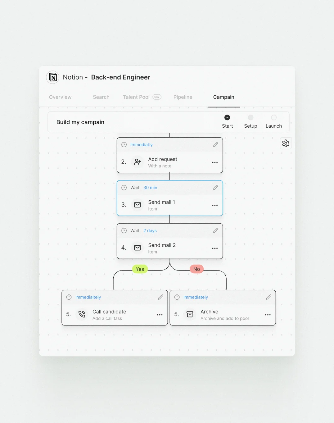
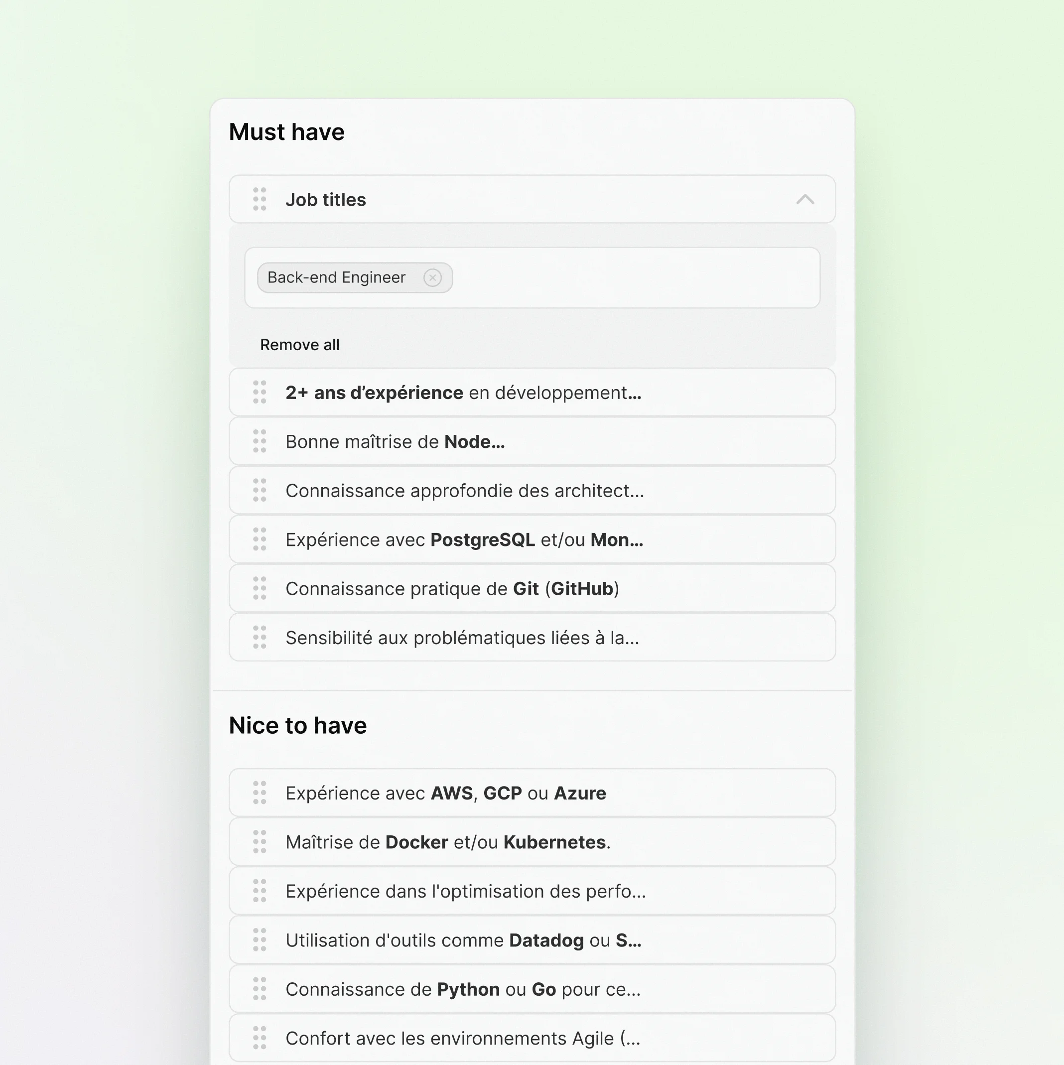
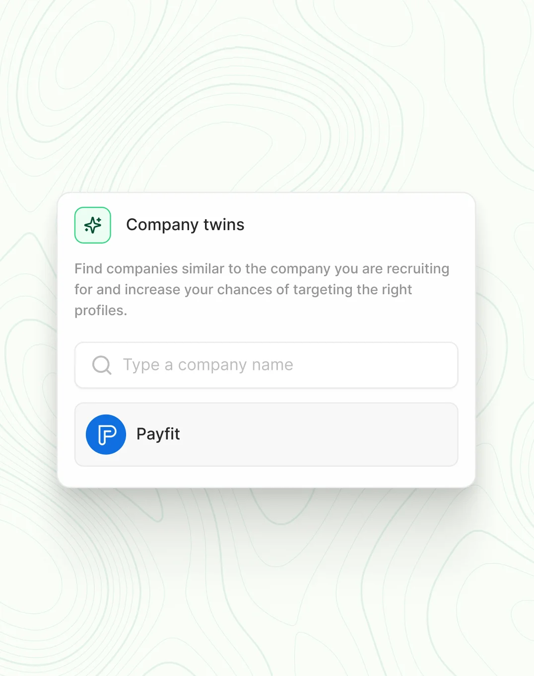
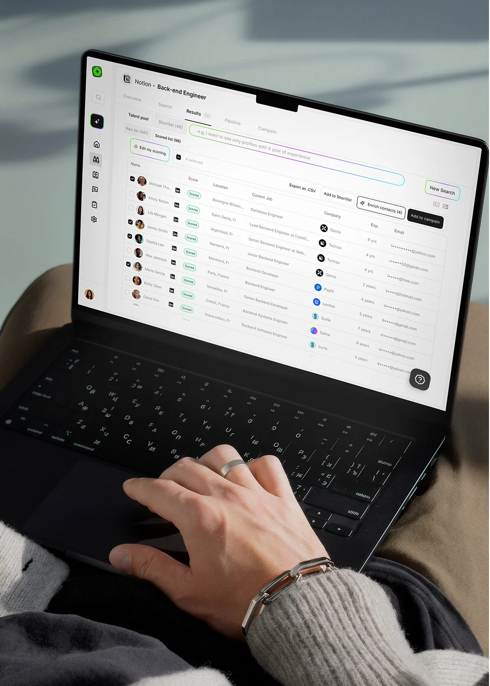
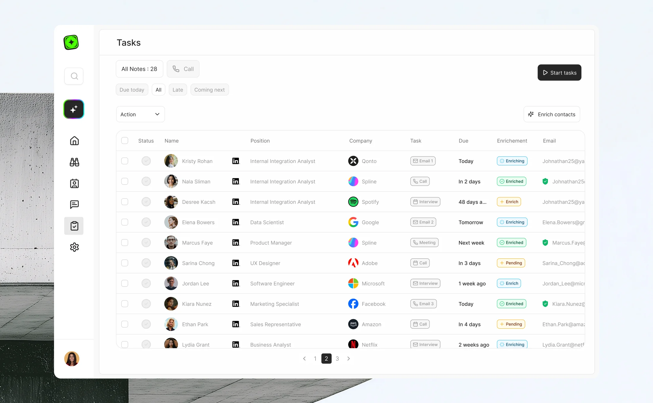
Early wireframes showed that simplifying steps wasn’t enough: the flow itself needed rethinking. I explored a new interaction model, letting recruiters launch searches in natural language and refine them with drag-and-drop criteria. This made the process faster and more engaging. Later iterations added smart features like Company Twins and bulk enrichment, reinforcing a feeling of seamless automation and control.
(04) Results
A product built for autonomy and scale
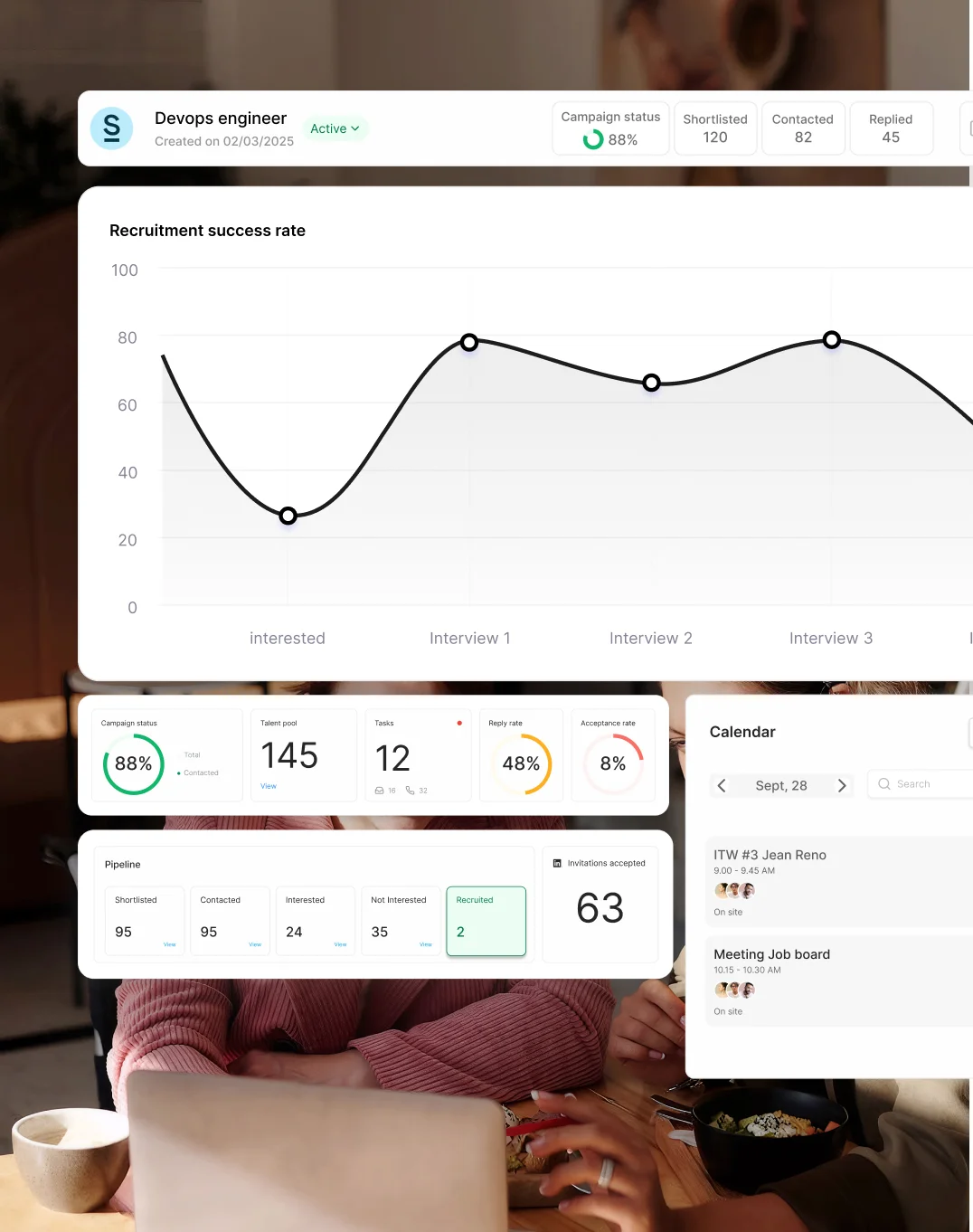
The redesign marked a turning point for TalentFindr. What was once a powerful but complex tool became a streamlined, self-service experience that recruiters could navigate with confidence. Within a few months, the number of campaigns launched independently grew by over 25%, while support requests dropped significantly. Proof that the product had become both intuitive and empowering. Beyond metrics, the redesign reshaped how TalentFindr was perceived: not just as another sourcing tool, but as a smart, accessible platform where automation feels natural and control remains in the user’s hands. This foundation now enables the company to scale faster, enter new markets, and continue evolving without compromising simplicity. Results: a 25% increase in self-service usage, a 30% drop in support tickets, and a 20% increase in conversion.