
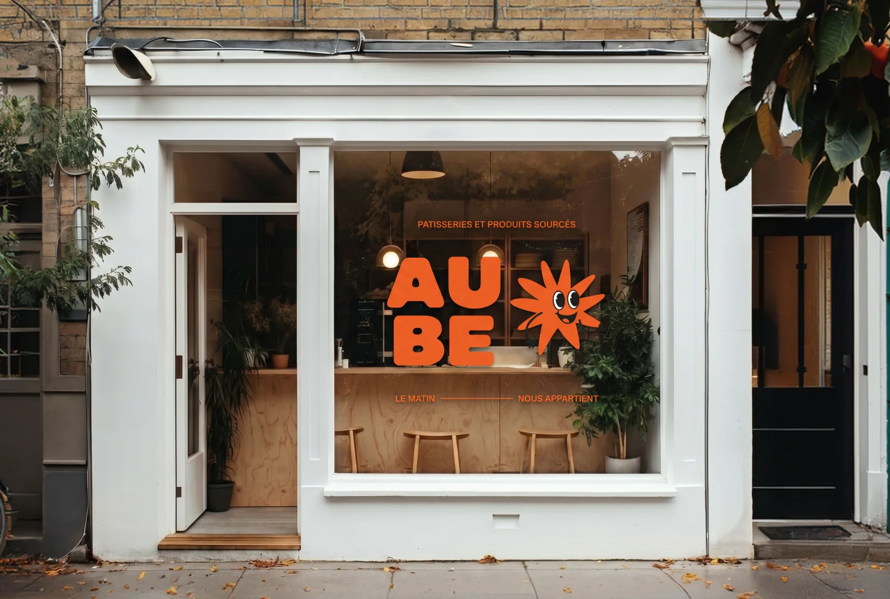
Aube
Client: Aube, Year: 2026
Aube makes products that wake people up, but said so nowhere. Over two phases, I built the brand around that single gap, from the central idea and the criterion behind every decision to a full visual identity ready for the street and the feed.
(01) Overview
Turning a bakery that wakes people up into a brand that finally says so
Anissa and Martin were opening Aube, a bakery and pastry shop in Champs-sur-Marne. The bread comes out at 7am, the coffee is poured before the rest of the neighbourhood is awake, and the quality is real. None of it was showing anywhere. They came to me with no mark, no type system and no visual language. I built the brand from the ground up across two phases, from May to July 2026: strategy and territory first, then the creative directions. The brief had to reach two very different people at once. The regular, who comes three to five times a week and knows Anissa by her first name. And the scout, who follows the food scene, photographs what he finds and passes it on.
(02) Approach
One question that settled every decision after it
I explored three territories and drew two of them all the way. Handcrafted builds lettering in which the flipped "a" becomes the "e", so the name opens and closes on the same sun. Bold Expressive goes the other way, with a wide hand-drawn wordmark and a sun that turns into a character. Anissa and Martin chose the second.
(03) Identity
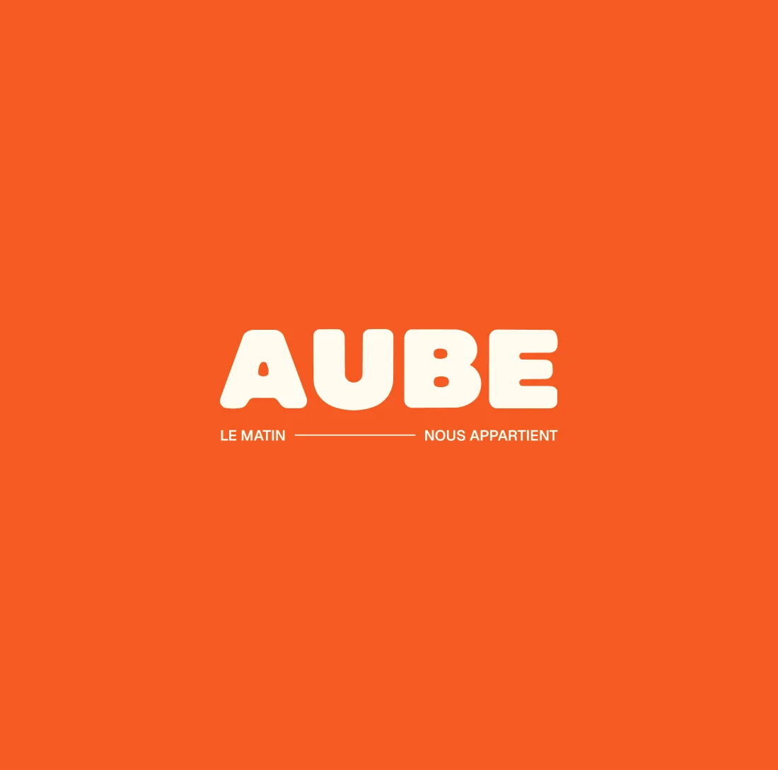
A hand-drawn wordmark and a sun that became a character
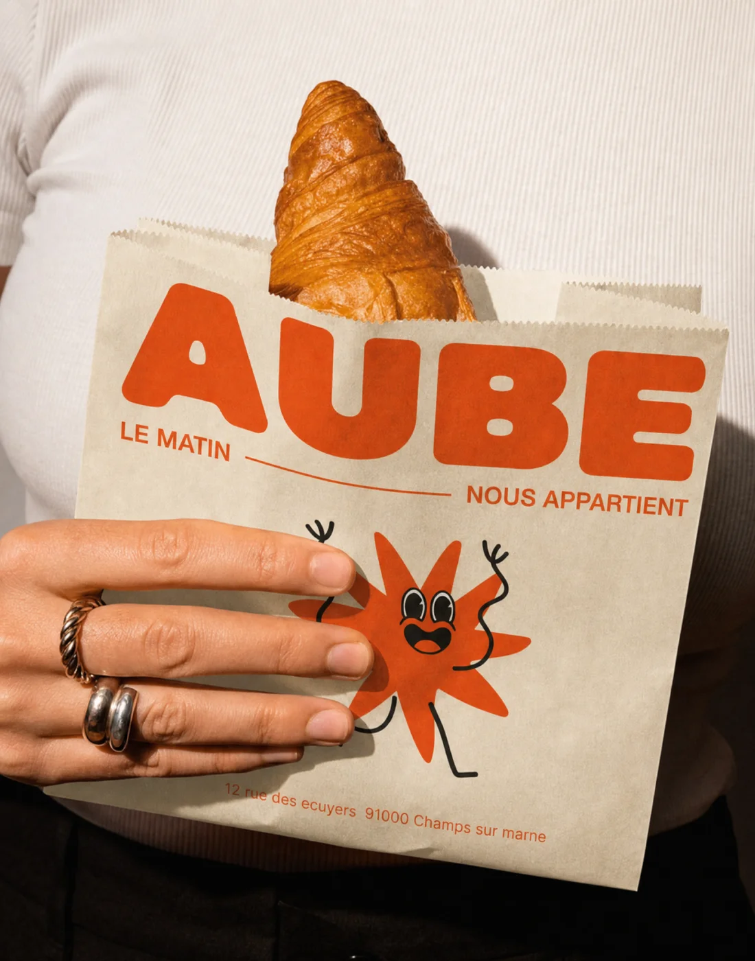
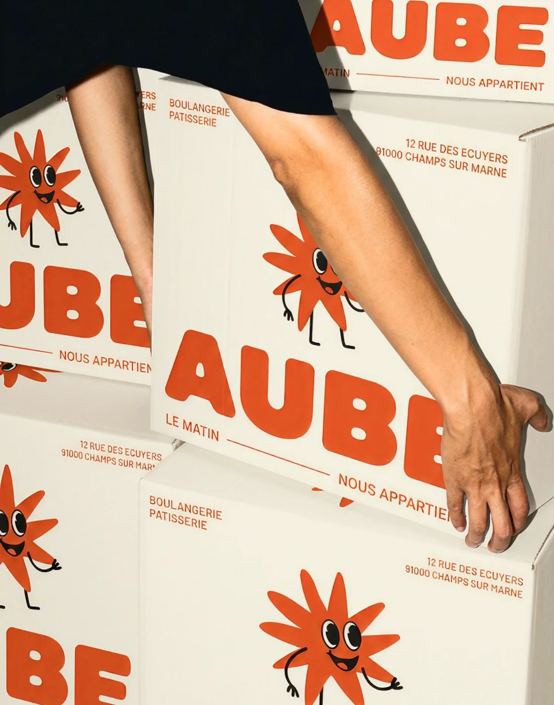
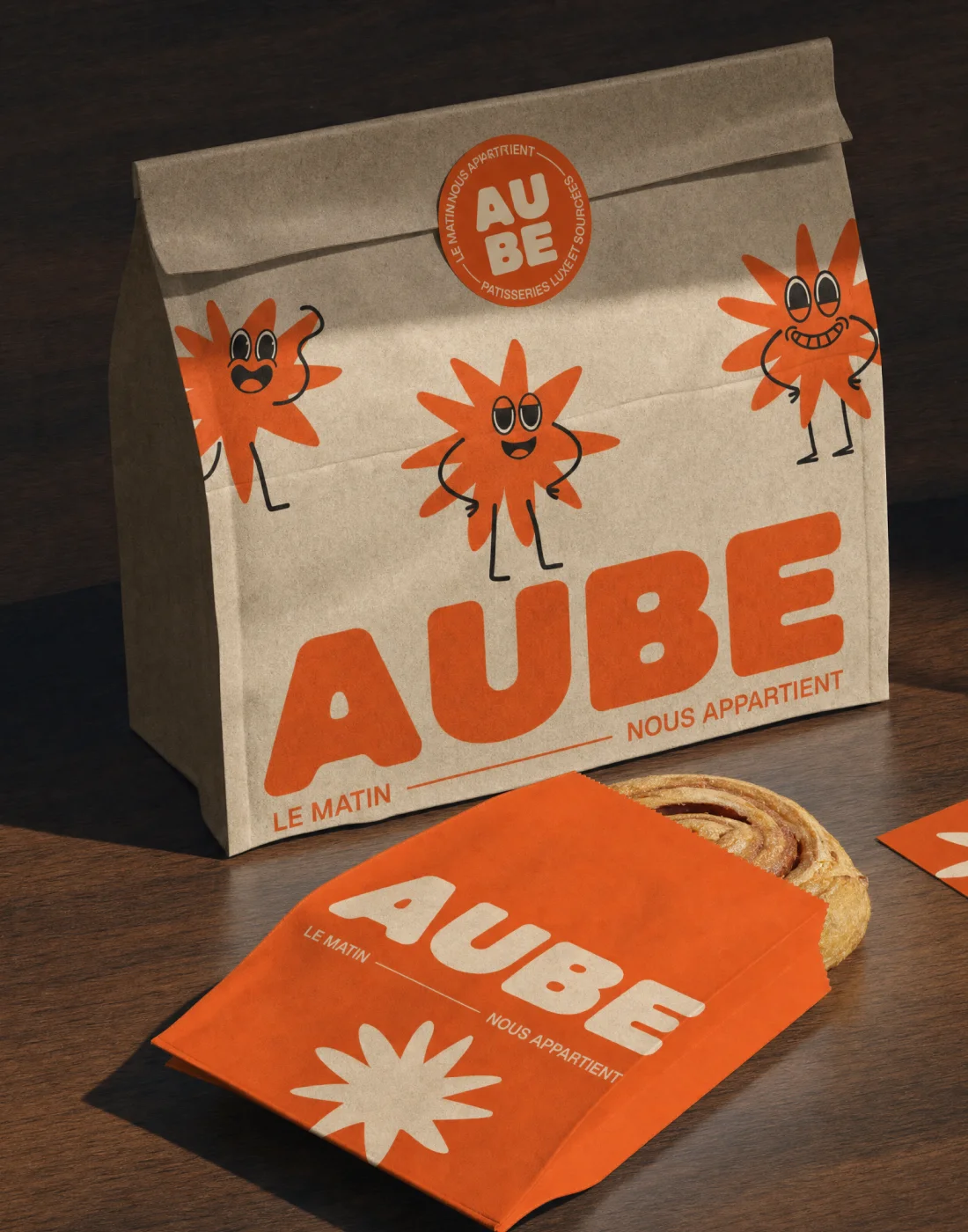
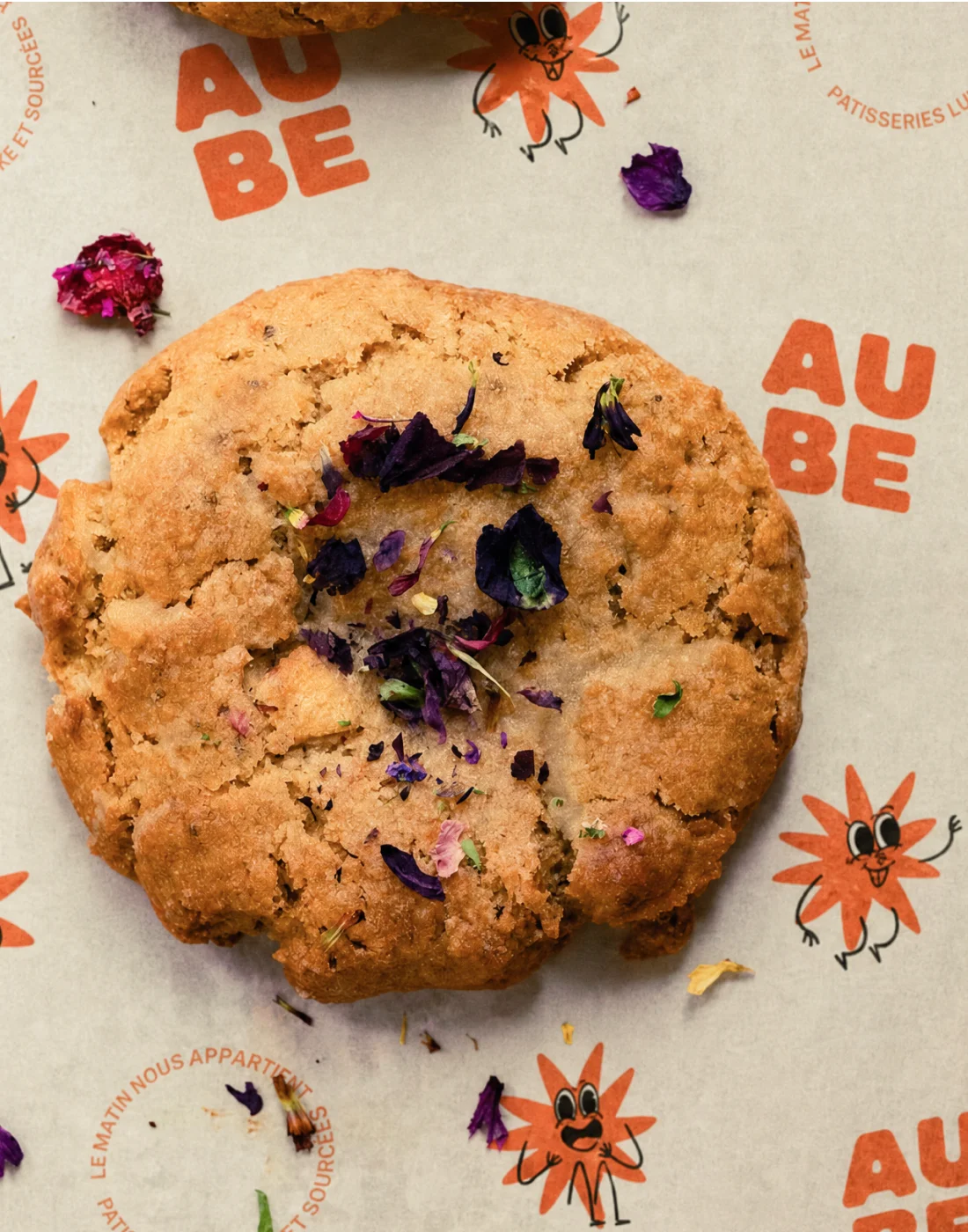
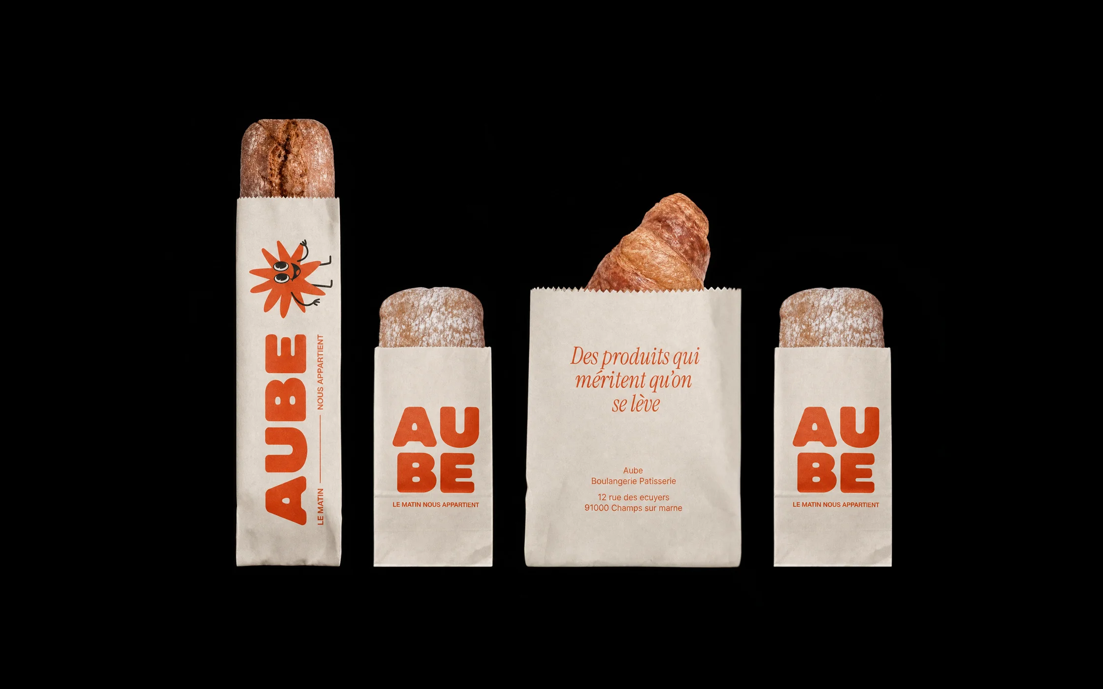
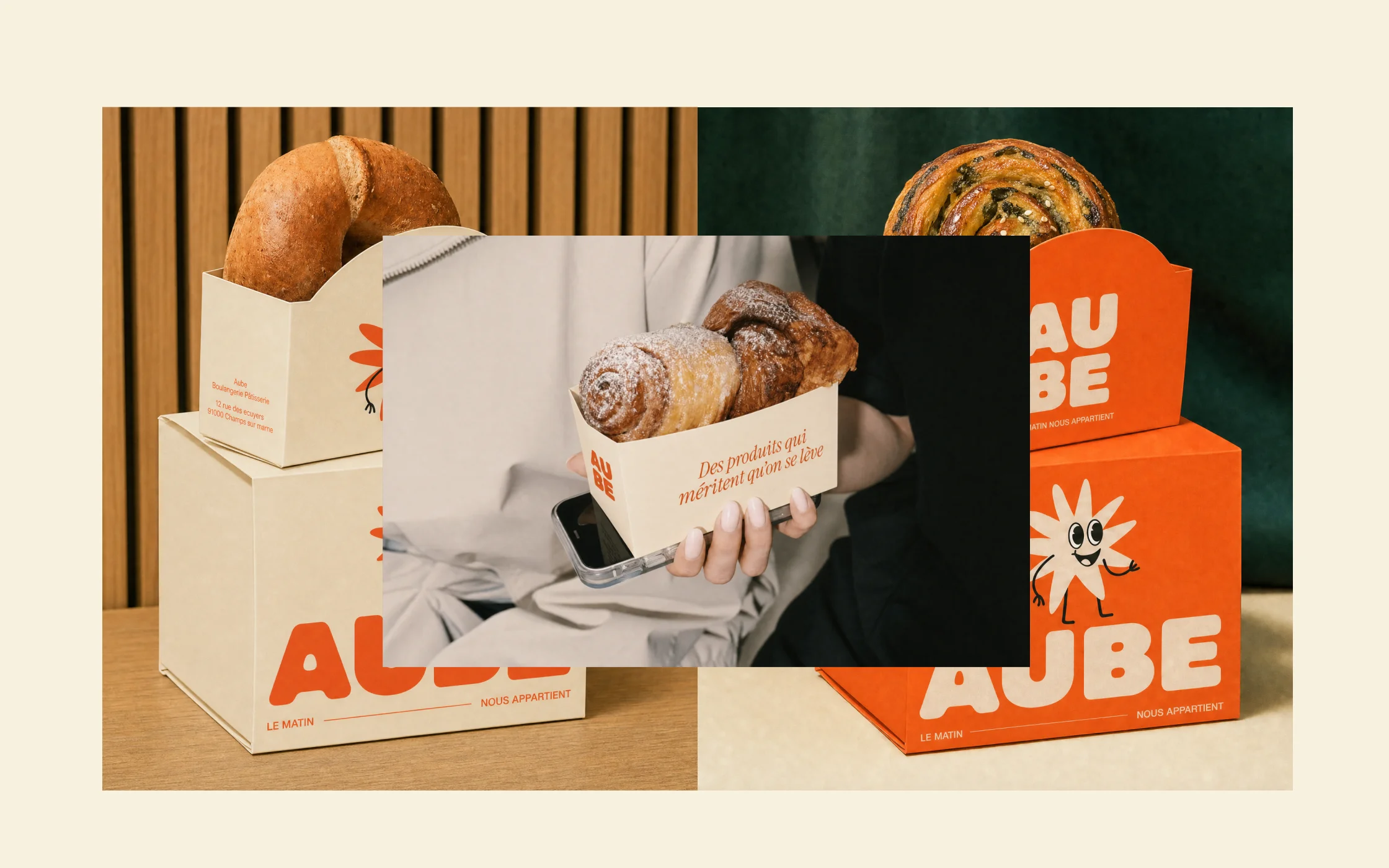
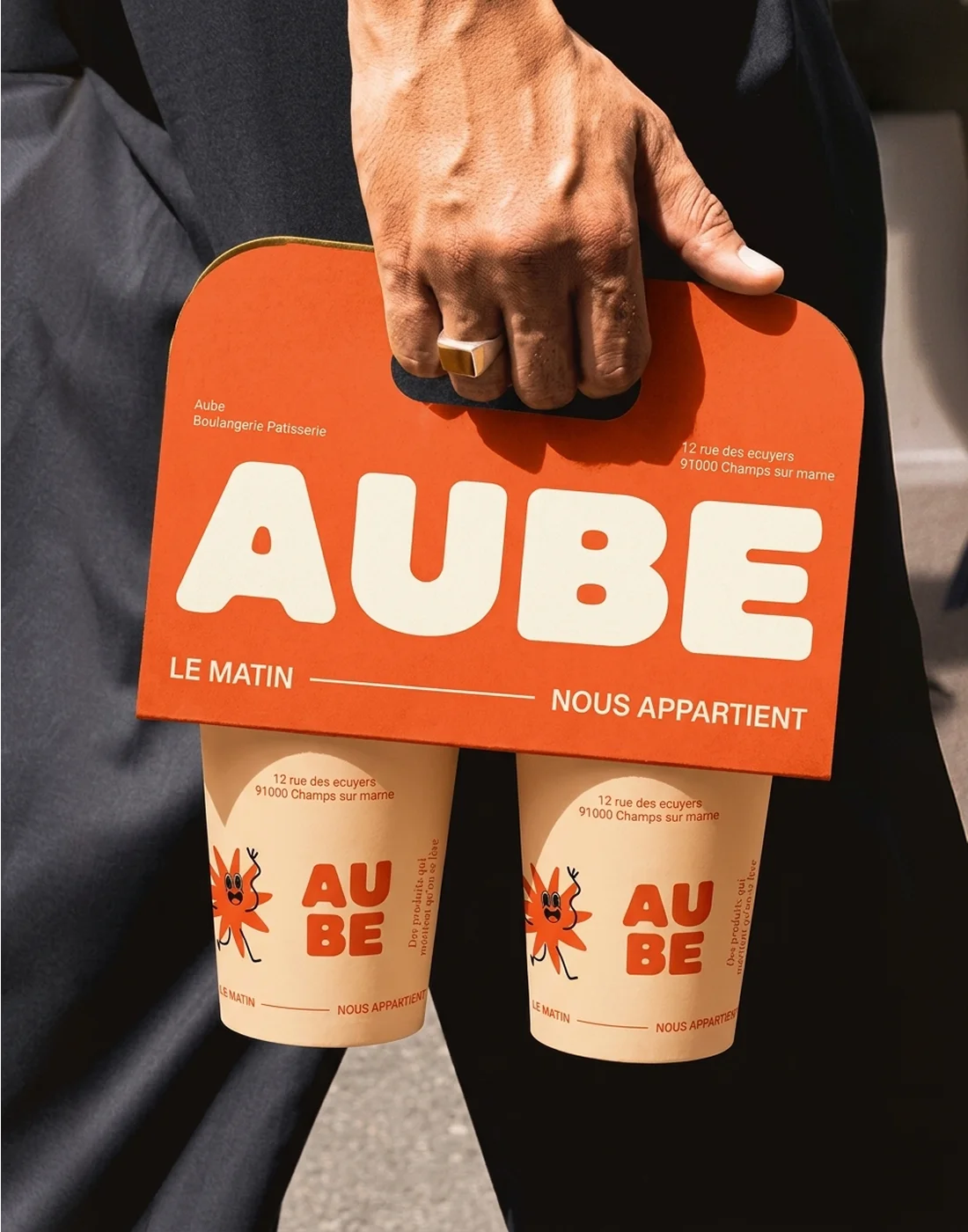
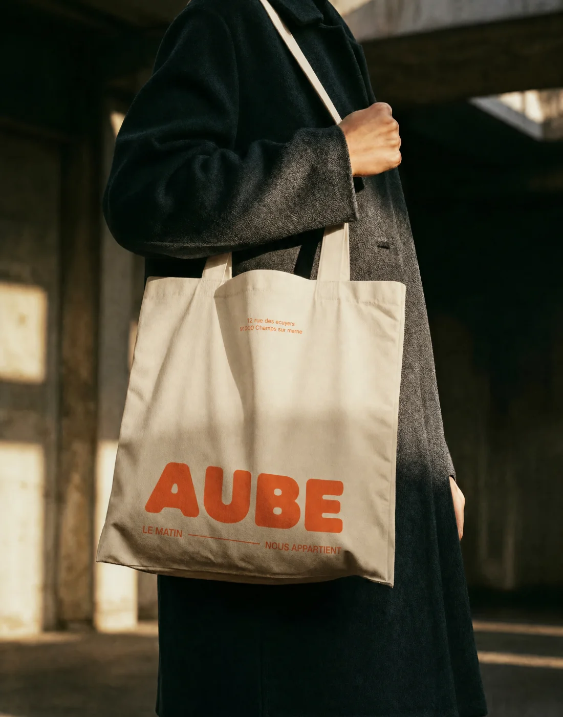
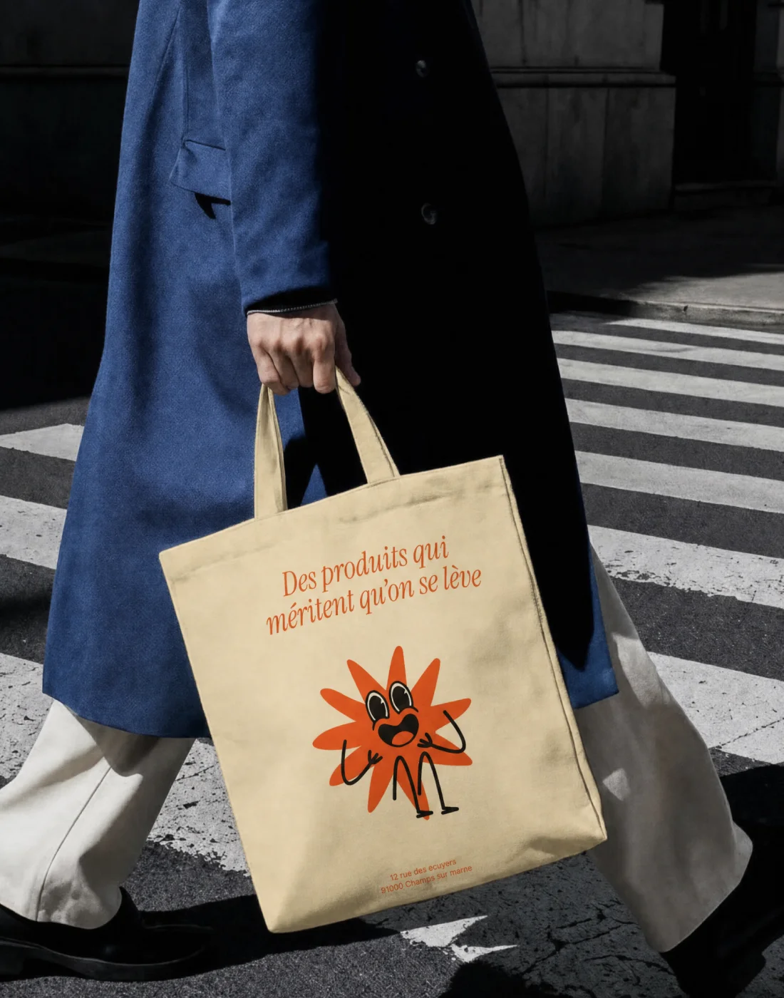
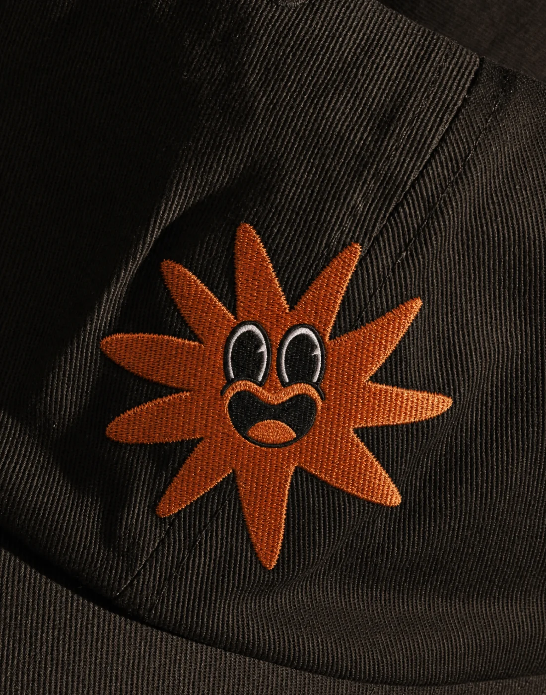
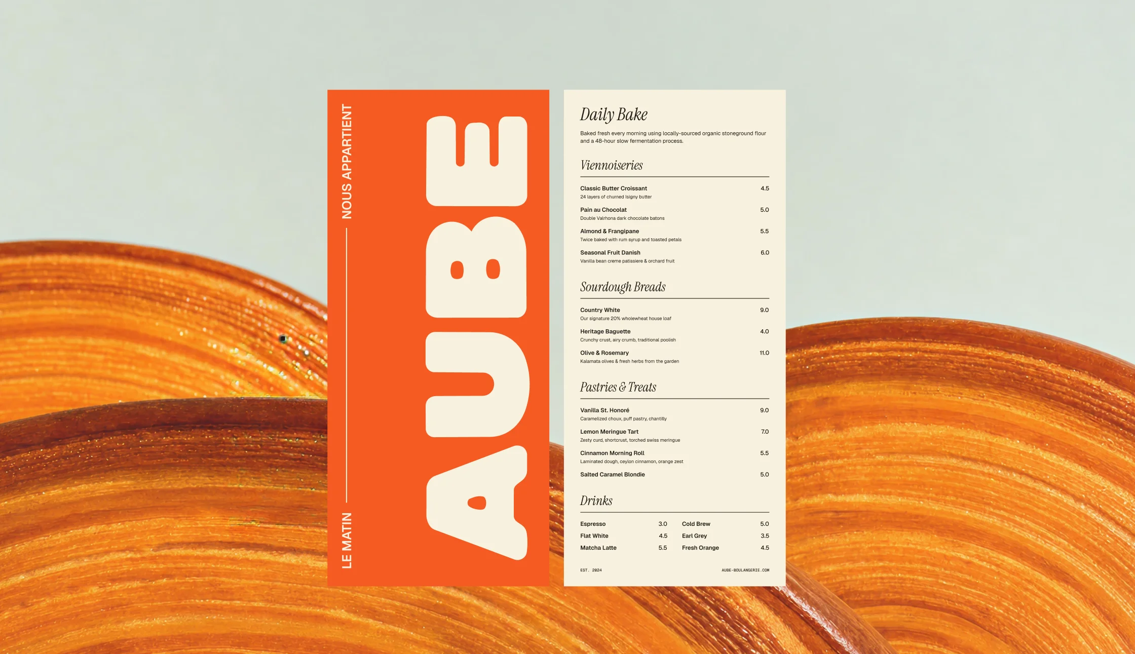
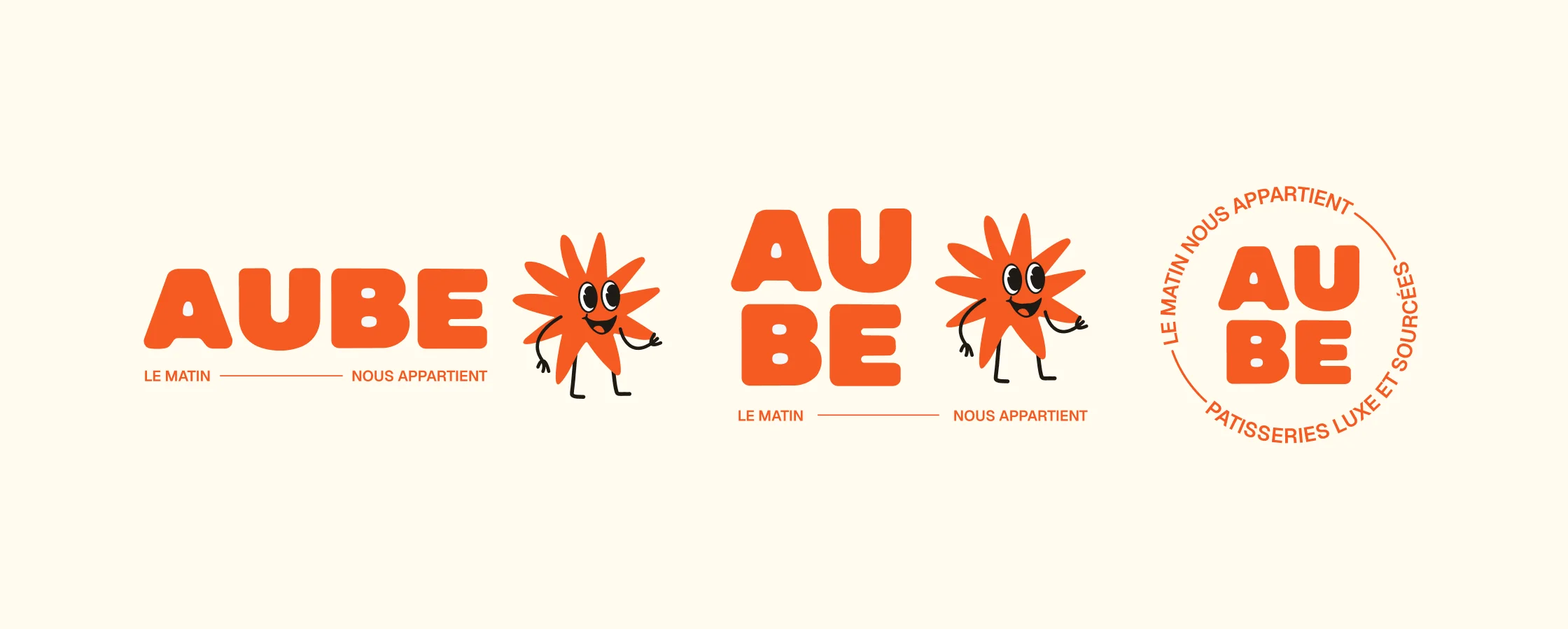
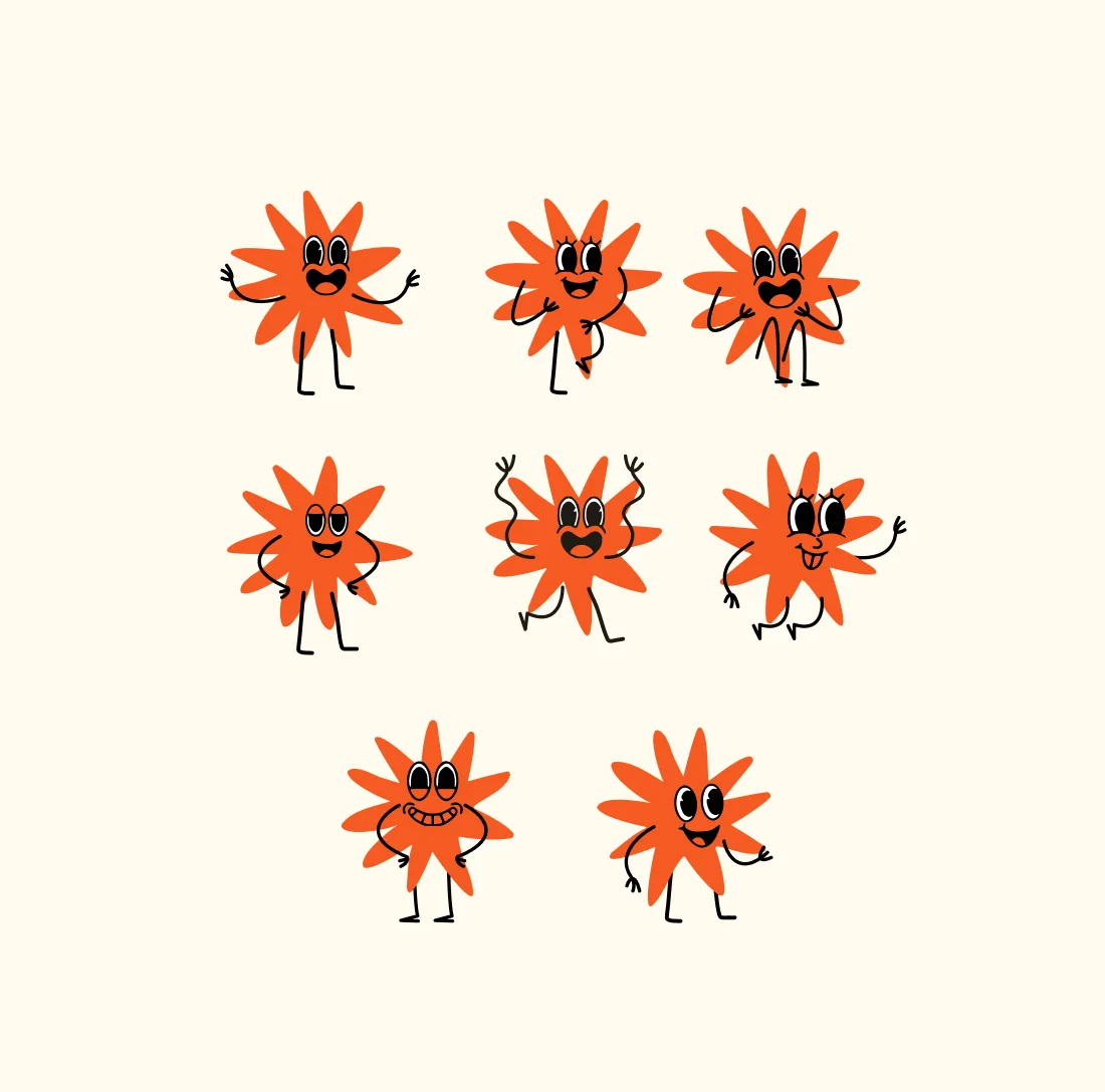
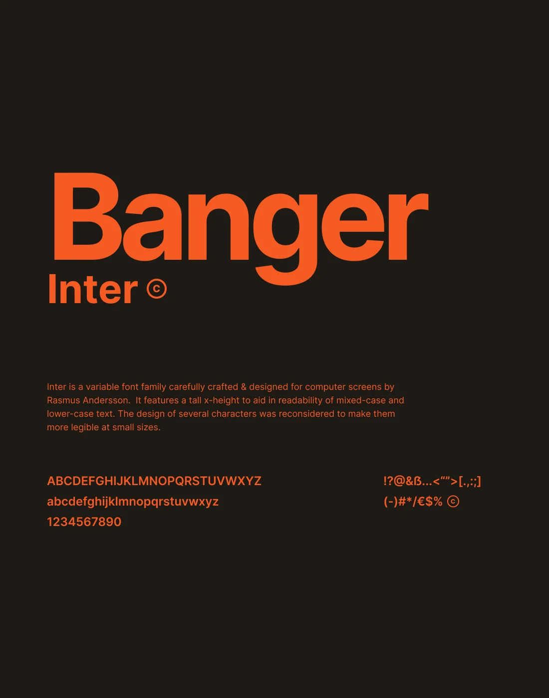
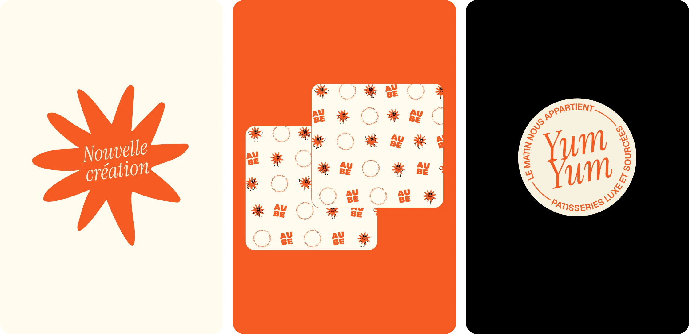
The lettering is drawn by hand: bold, stable, slightly rounded. The irregularities are deliberate, and they are what makes it readable from across the street. The sun sits inside the word or lives next to it depending on the format, and it works in two lockups: a full block with the mascot for storefronts and bags, a round stamp for labels, packaging and small formats. The sun then becomes the mascot. Same shape, same colours, with a face and a set of poses that let it greet, react and speak to people while the wordmark just signs. Around it, a four-colour palette led by Vivid Terra, Inter for information, Instrument Serif for accents, plus a pattern and a badge system built from the sun itself.

(04) Applications
An identity made for paper bags, aprons and phone screens
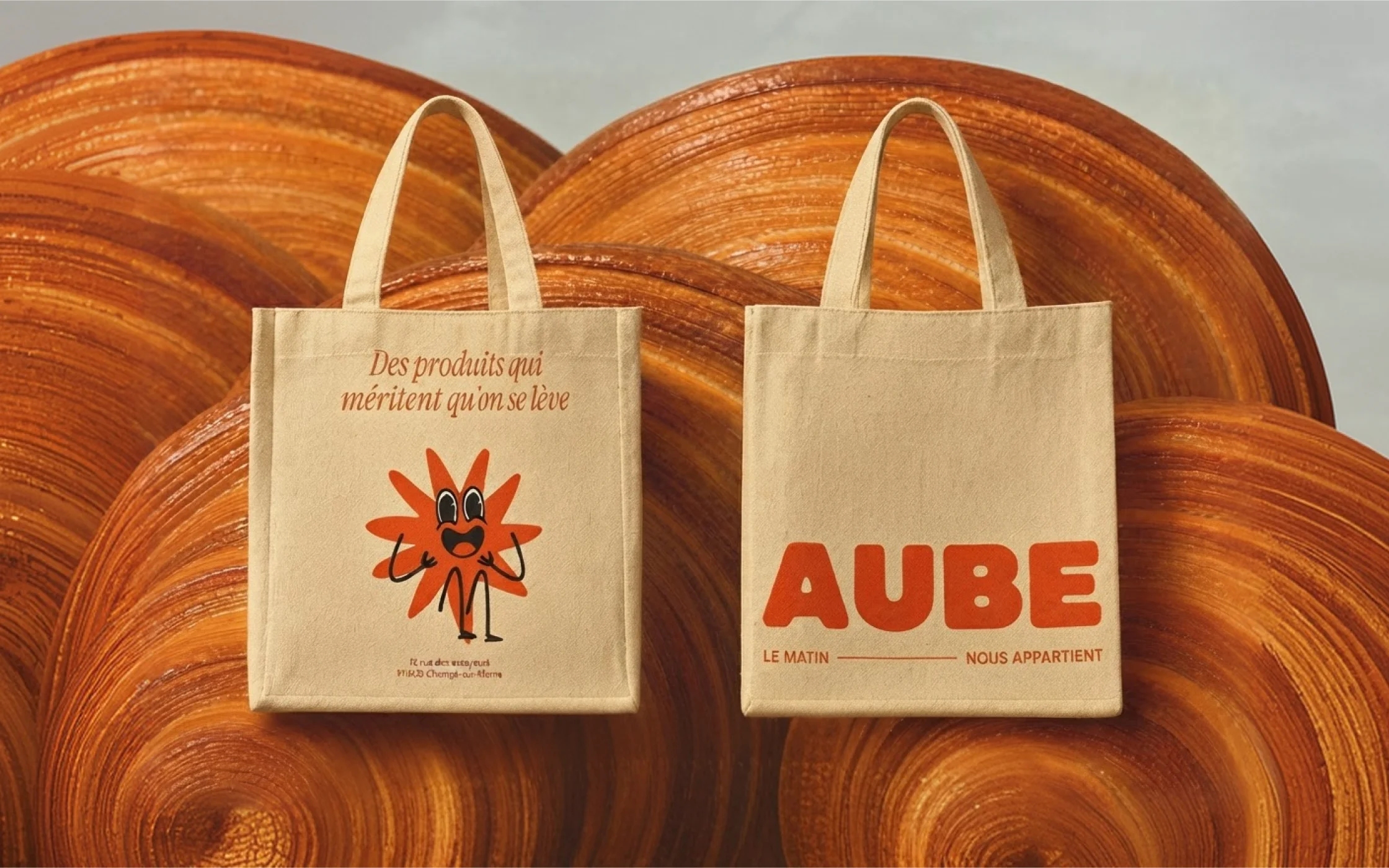
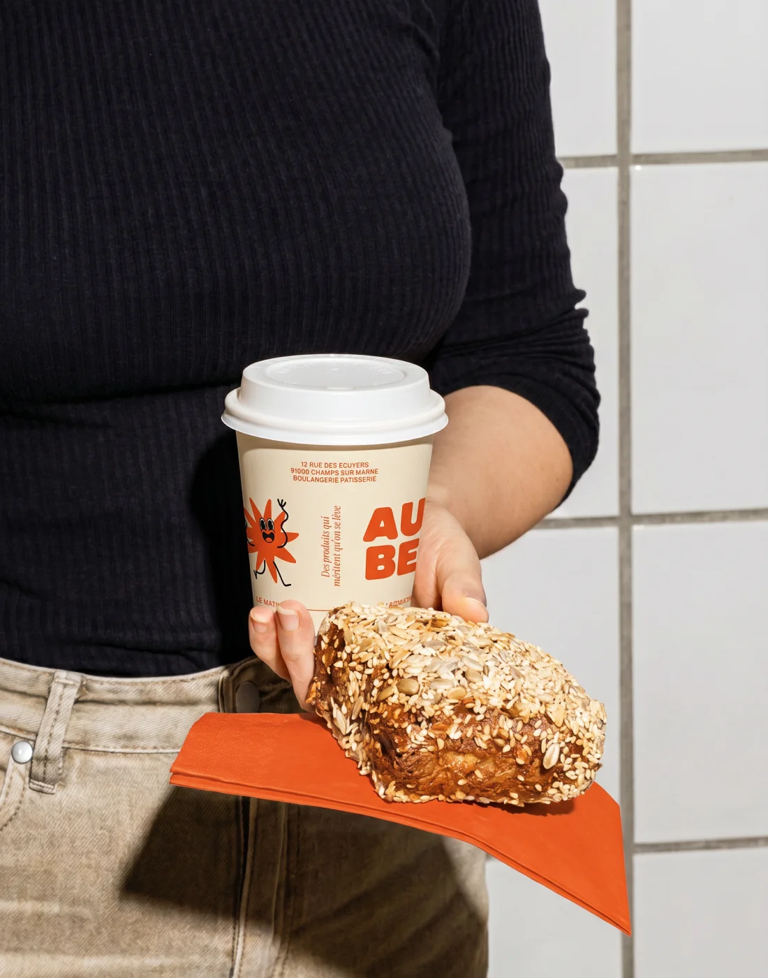
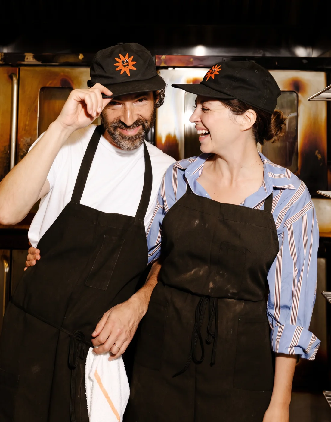
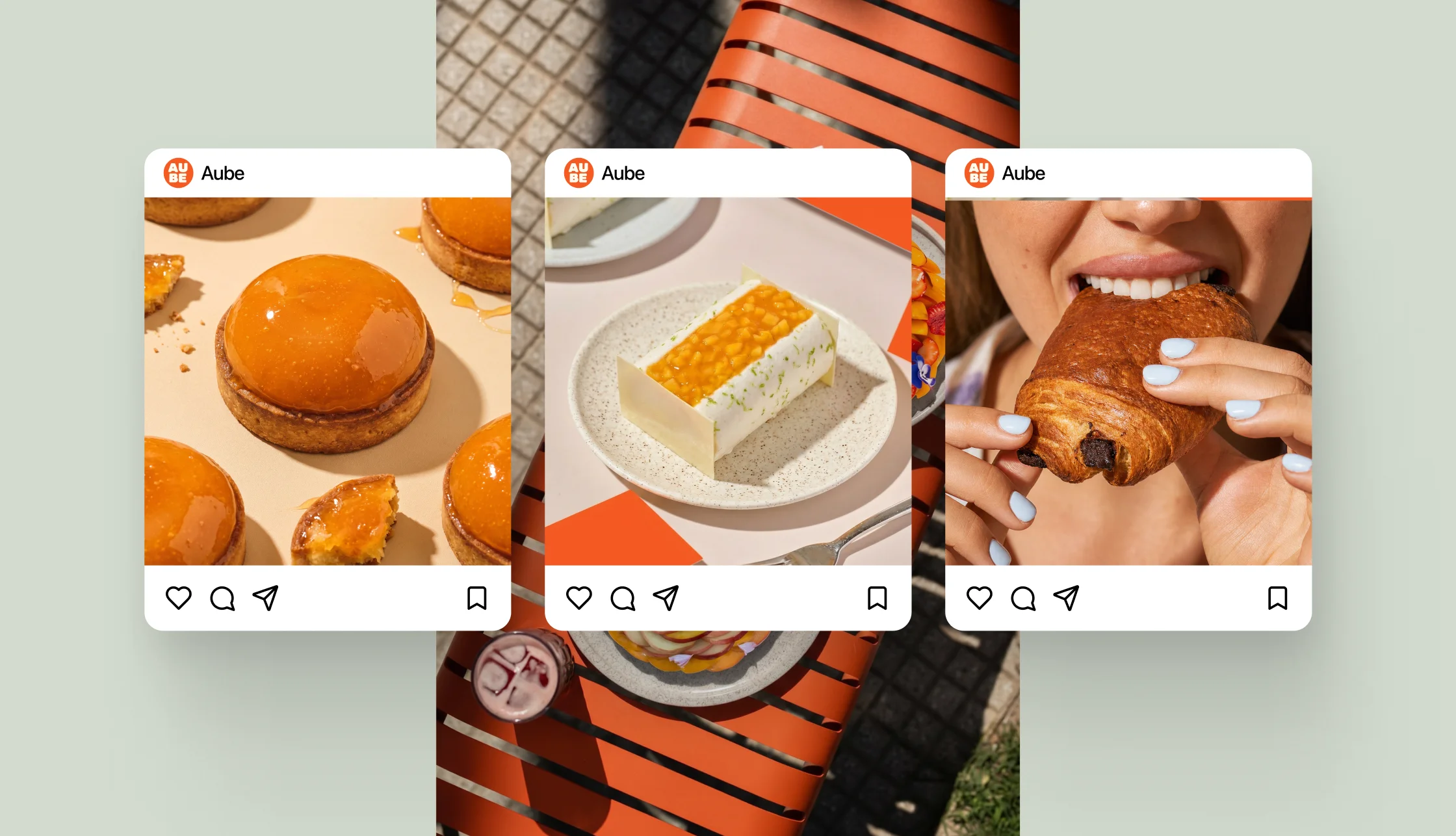
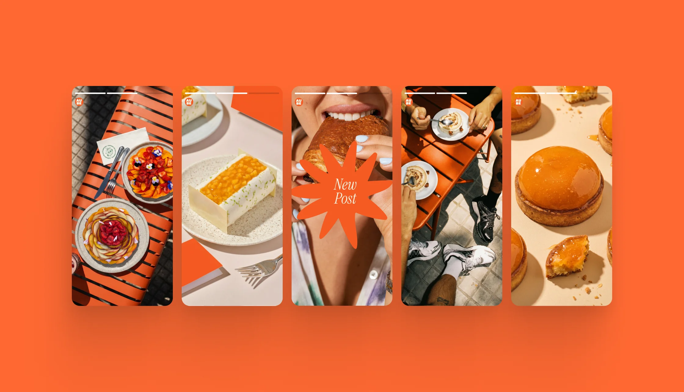
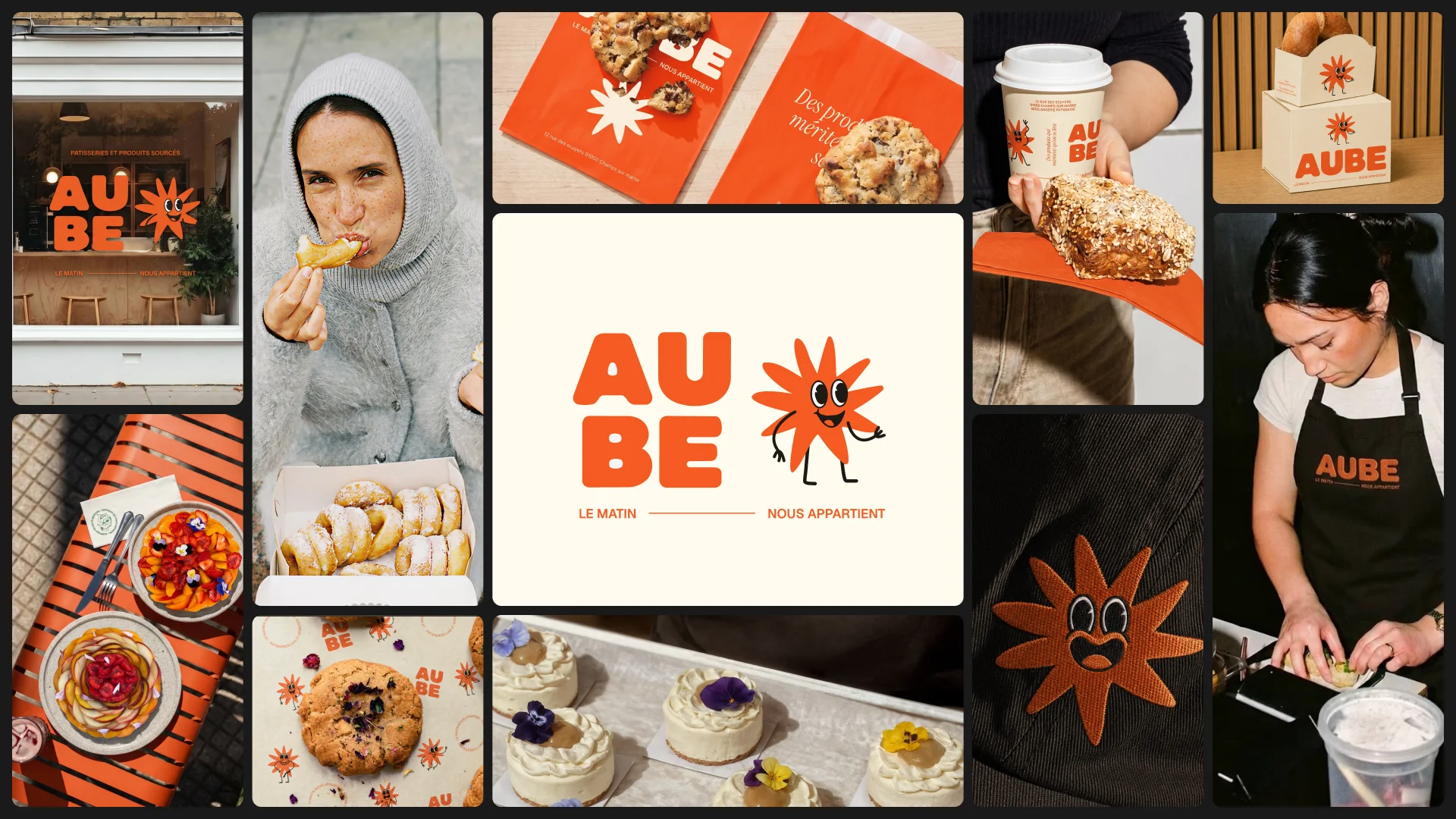
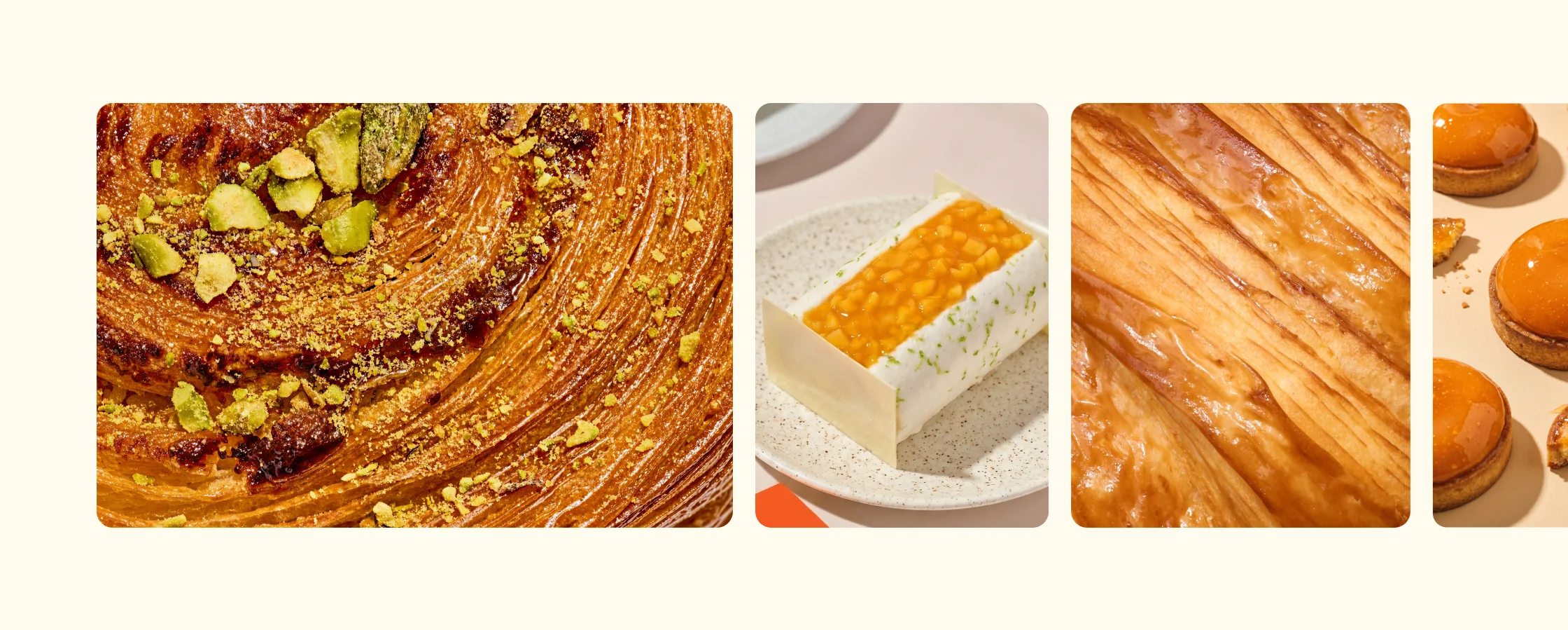
The system was designed for the surfaces a bakery actually uses. Bread bags, pastry boxes, cups and carriers, tote bags, caps and aprons, the loyalty card, the menu board and the Instagram grid. Each one takes the piece of the system it needs: the block on wide formats, the stamp on round ones, the mascot wherever the brand has to be friendly. The photography direction holds it together: hard direct flash, and three registers: team, people and product. The identity is currently in development, and the visuals shown here are simulations ahead of the opening.